Graphical Visualization of ns-O-RAN data with Grafana
How to setup Grafana and visualize plots from ns-3 simulation data
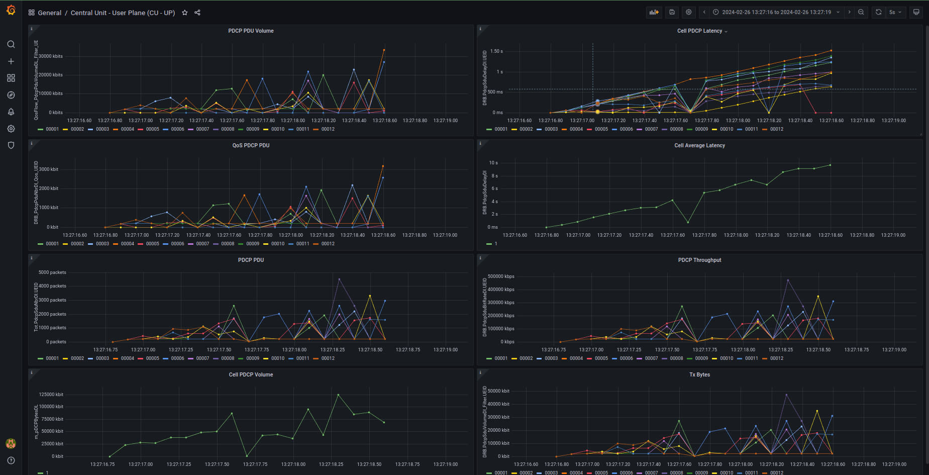
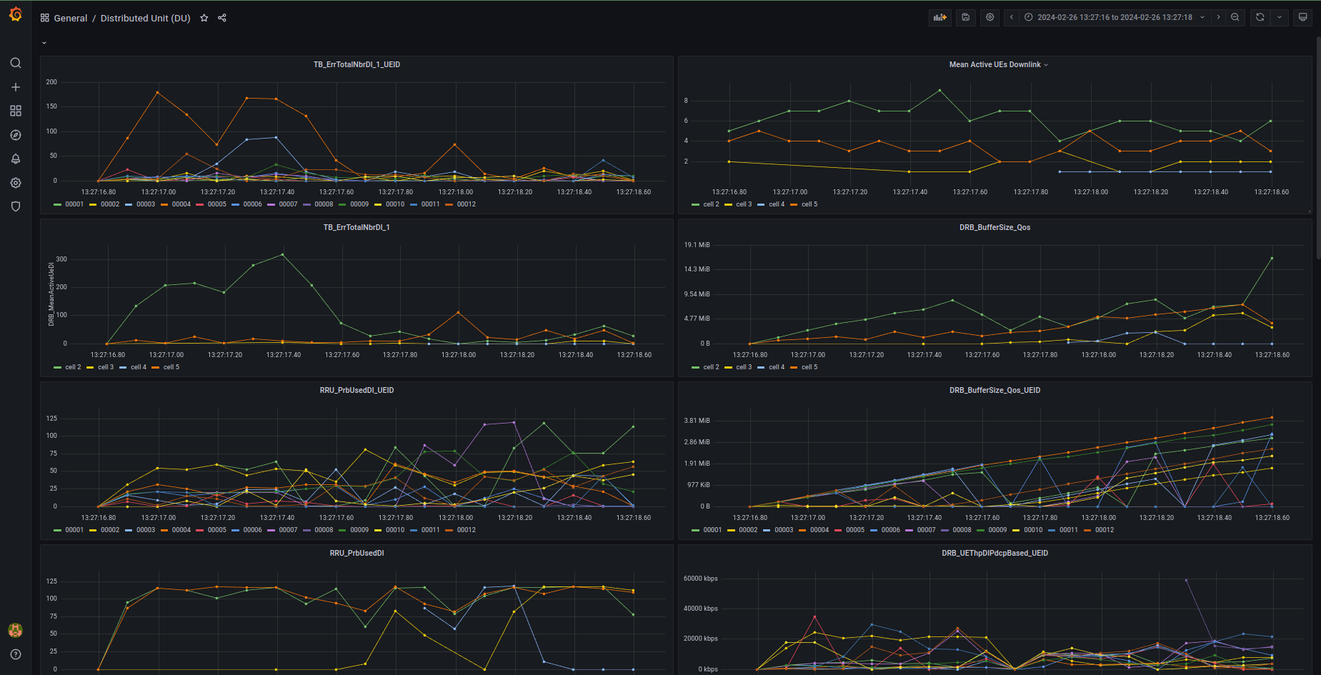
This tutorial illustrates how to visualize ns-O-RAN simulation data using Grafana. The presented example extracts information from an ns-3 simulation, sending it to InfluxDB through Telegraf. This process enables Grafana to pull and display the data on a dashboard, streamlining analysis and interpretation. Four dashboards were created, with three specifically designed to visualize the Key Performance Measurements (KPMs) extracted from the simulation, namely Central Unit (CU) -User Plane (UP), CU - Control Plane (CP), and Distributed Unit (DU). The fourth dashboard shows aggregated data extracted from KPMs.
The code of this tutorial is available in this repository.
Prerequisites
Docker Compose is needed for this tutorial.
Services and Ports
The following services will be opened thanks to Docker Compose:
Grafana
- URL: http://localhost:3000
- User: admin
- Password: admin
Telegraf
- Port: 8125 UDP (StatsD input)
InfluxDB
- Port: 8086 (HTTP API)
- User: admin
- Password: admin
- Database: influx
How to run the project
Start the stack with docker compose
$ docker compose up
Then open Grafana in a browser, using:
- URL: http://localhost:3000
- User: admin
- Password: admin and select a dashboard. On a terminal, run the python script
$ docker compose exec ns3 /bin/bash
$ cd ns3-mmwave-oran
$ python3 sim_watcher.py
This script is a watchdog that monitors the output files of the ns-3 simulation within the directory. The data generated by ns-3 is collected and sent to InfluxDB through Telegraf, which is then pulled by Grafana for visualization.
On another terminal, run the ns3 simulation
$ docker compose exec ns3 /bin/bash
$ cd ns3-mmwave-oran
$ ./waf --run "scratch/scenario-zero.cc --enableE2FileLogging=1"
You may want to set the following options in the last command:
--RngRun=n, where n is a positive integer representing the seed for the pseudo-random number generator.--simTime=x, where x is the simulation time (in seconds)
If you want, you can access the InfluxDB service with:
$ docker compose exec influxdb influx
> use influx # to select the database called "influx"
and visualize the metrics with:
> show measurements
or the entire tables with queries. For instance:
> select * from /L3servingSINR3gpp_cell_[0-9]/
show the tables containing SINR3 values measured at the network (L3) level for the 5G cells.
Dashboards
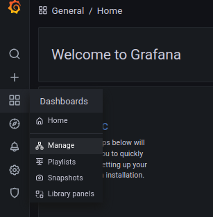
In Grafana, go to ‘Dashboard’ then ‘Manage’.
Four dashboards are available:
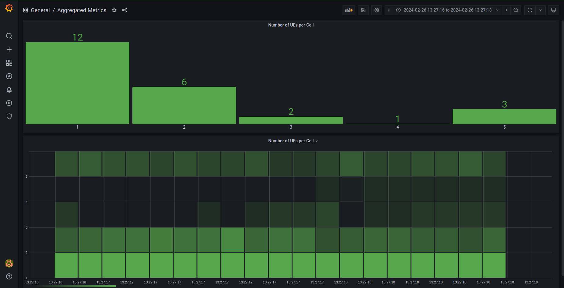
- Aggregated Metrics: currently showing only the number of UEs connected to each cell from the last update (histogram) and in all the simulation (heatmap).
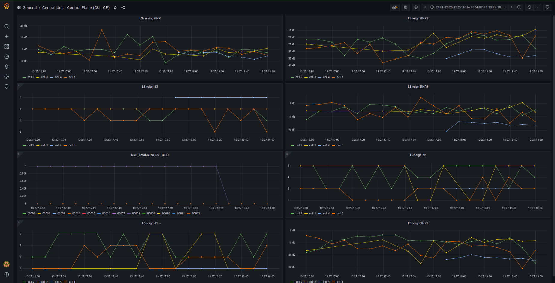
- Control Plane (CU-CP) dashboard.
- User Plane (CU-UP) dashboard.
- Distributed Unit (DU) dashboard.
Usage
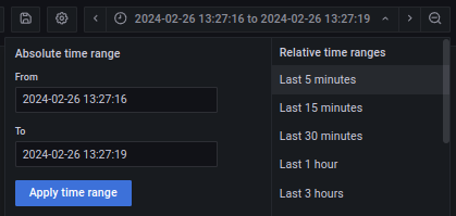
Once everything is running correctly make sure the absolute time range on Grafana is set to “Last 5 minutes” so that data will appear as soon as it is sent. When data is visible you may want to change the absolute time range: “From” should be the timestamp of the first visible measurement, while “To” timestamp + simulation time.